Friday, December 15, 2017

My Website

My Website

 About The Website 

The website I made took a long time to make. It turned out great, but I still had a couple slip ups. At one point dreamweaver started to glitch out on me, so I had to redo what I was doing.  It has some pastel colors to complement the colors of the projects I have in the website. I learned a lot from this project, stuff I wouldn't have known if we didn't do this. I just can't believe I made a website, and I hope you think its as cool as I think.

The Process Of Making It

 We did this project on dreamweaver. First I made the front page, put our picture on it, and made all the links work. Then I made the projects page, and put 4 projects on it. I made the link work that goes from the home page to the projects page. I made a youtube channel and copied a link for my bouncing ball project in it. After
that I colored it, and changed the fount. When I was finally done
I looked back and previewed my website. I think it turned out great.

What I Think Of It

My website looks great, works, and is a really big accomplishment of mine. Yes it did take a long time, and yes I did mess up a few times, but I am very proud of it. It takes a lot of effort, knowledge, and patients to make a website, and somehow I was able to do it. I hope that you guys like it as much as I do.

Wednesday, December 13, 2017

My House Design

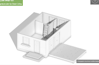
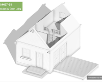
About The House

The house was based off of another house that I found on 
http://www.houseplans.com. It is a really small house, but 
it is a cute small house. there is a front porch, and a pitch at
 the side that could be used as like the back door. The house 
is a log house, and has really detailed features or it, for example, 
the windows come out at a point and have cool designs on it. 
The house also has a chimney. 


The Process of making it

This project took little bit longer than I would have expected. 
I would either keep messing up, or it wouldn't save, witch was 
a little bit frustrating. We used Sketchup, and honestly I didn't
 really like using Sketchup. First we found an image online, 
then we based the structure off of it. The house I choose was a 
little bit basic, so I made mine little bit more complex. after we 
made the structure we made details, and then colored it all in. it 
was sorta like a big coloring book. We went online and found 
some images that we could use for our house and turned them 
into wallpapers, and put them on the house. Then we made slides
 for our animation, and saved for web. We finally finished, and I 
am happy with how it turned out.


What These Are

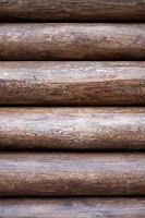
The images below are photos that I found online and
turned into wall papers that I could use. I used all three
of them, and it was fun to have made the wall paper a
wall paper myself.


What I Think Of My House

The final product was little different than the picture I was going off of, but I still think it was a really cool house. I love how it turned out. The house itself took a while to make, and I even had to start over a couple times because either I completely messed up, or it didn't save. I didn't really like using Sketchup, but I still had a lot of fun. I hope you guys like it just as much as I do.

Thursday, December 7, 2017

Bouncing Ball gif

My Bouncing Ball Animation!

About The Projects

All three of the animations I made are all done in Photoshop.
Each layer of the animation was all done on the computer. The
background and balls are hand drawn with my mouse.  In al it
took approximately 3 days or more per animation. There are
more than 15 slides for each animation.

The Process Of Making Them

Each animation took about 3 days to make. It took so long
 because each side had more than 15 slides, and it took a wile to
 figure out how to make them. First I made the grass  in the
 background with 2 or three different colors. Next I made a
second slide with the balls on it. I drew a line to show how I want
it to bounce and then made a hole bunch of slides for each
individual ball. For the alien project, it took along time to do all
 of the details. I almohad to hand draw and animate the alien eating
the ball. It was all worth it tough because each animation turned
out really cool. 


What I Think About The Project

I love the way my project turned out. It did take a while to do, and
to figure out how to do it, but it was still really fun. The way my last
 one turned out was my favorite one. I like how no one else made
theirs like mine, and that I can be proud of it all because I hand did
everything. The Idea of 3 suns was from movies inset watch as a kid.
 I made the alien black and green to stand out, and I made the ball
look like it does because I think it looks really cute. I am proud of all
 the projects I did, and am happy I turned how to do them.

Friday, November 10, 2017

10 Words Gif

10 Words Gif


About The Gif

This project is 10 words that describe me. This project is also my first animation! For the animation I was told to put my name and the 10 words used to describe me, they were picked out beforehand, and to make them appear on my project. Right in the middle is my name. I chose the colors you see to make sustain words stand out. Some of the words chosen for me was things like rhythm because I love music and I am always keeping a rhythm with me, or story teller because I love to tell/make stories and I'm always making one and in my own story. I loved making this animation and I hope you like it too.

Process

For this project I went on photo shop and started off by writing my name. Then I typed out the 10 words that were used to describe me. I love founts so I chose a different fount for almost all of the words on my project. After I chose my founts I put different colors to make curtain words, and my name stand out. After that the real fun began. Now was the part for the animation. I took each word one by one and put them out of the shot only to come back in. This was a long proses but it was worth it. After I finished the animation I saved it and now its on my blog for everyone to see. 

My Personal View Of My Final Project

I personally loved making this project. Some things were hard to do, for example; animating every single word one by one, or making sure its all spaced out right and looks good. Even though some things were hard I still had fun making it, and I have pride every time I watch it. The finished project looks good to me, and I hope you like it as much as I do.

Tuesday, October 17, 2017

My Logo


My Logo

The Process


When I started this project I was thinking about what cool thing I could do with the letter S for Sydney and/or D for Decker. I drew a lot of different designs, as shown below.


I picked my top 4 designs and immediately knew which one I liked, I chose the first one. I liked the fact that no-one else would have this design. When I started the design I chose it started with a cursive S, and changed it until it looked like what it is.


I started to create my design on Adobe Illustrator, and messed around with it. I found some good founts that I liked and could use for my logo. I accidentally moved the inner triangle down little and liked it, so I just left it.

I started to play around with the color, and desired I liked the mistake design I made, so I colored it too. The colors I liked most was the orange, mint, purple, and blue. I asked my fellow  classmates which color they liked best and the majority was orange, witch was good because I liked the orange the best. I really wanted to put it on a black shirt so I tested what it would look like on the black. My final product can be seen either above or below


Then I put my logo on a t-shirt, that I customized, and I love how it turned out.

Why My Logo Is How It Looks


This is my final product! I personally love how it turned out, and I hope that everyone else agrees. I made the main color orange because it would stand out, and because orange is the color of happiness and warmth, and I want people to be happy and feel warm inside when they look at my logo. It has a red outline to make the inner color stand out more. I chose this fount because it looked professional and classy.


Everything is the same as said before, except for the mint green letters, witch are mint green because it stands out, I like it, and it makes it look really cool.

Thursday, October 5, 2017

Anatomy of Typing

Project Description

The project that I have done, and is shown below, demonstrates the Anatomy of typing by using my name. I used red for the lines and blue for the arrows so they would stand out better. The arrows are pointing to what the words are, for example; the counter is pointing to the blank space in the D, because that is what it is. The lines shown are the topline, x-height, and the bottomline. 

What I Learned

I learned what the Anatomy of Typing is, it is all the different parts of founts. For example; the arm of an E, or a T is a horizontal stroke not connected on one or both ends, or like how the hairline of a letter is the thin stroke of a serif typeface. All this new information I learned was really interesting to read and learn about.

How It Went


The project came out good. It didn't have all the words on it, because I didn't have all the letters in my name, but it had most of them. I learned a lot from this lesson, as you will read above. I had a lot of fun making it, mostly because I love looking at founts, but also because I got to use Adobe Illustrator more.

Monday, September 11, 2017

My Color Wheel

Color Wheel Project

My Project

The project I made look has different shapes for each the of color. I made the primary colors, Red, Blue, and Yellow, biggest and circles, secondary colors, Orange, Green, and Violet, a little bit size and squares, and lastly the tertiaries colors, RedOrange, RedViolet, BlueGreen, GreenViolet, YellowGreen, and lastly YellowOrange, are the smallest and they are triangles. I chose cuts founts for the color names and an intriguing fount for the title. Lines line up the primary colors, dashes line up the secondary colors, and the tertiaries colors are on the circle connected with everything.

What I Learned From This Project

During the making of this project I learned a lot of new stuff like new commands on the computer, and how to use adobe illustrator. I honestly barely ever used a computer before E-Com, so I didn't learn things like how command z is an undo shortcut, or how you can use finder to find adobe illustrator. 

How I Think I Did

I think that my color wheel turned out quite good, for being my first time using adobe illustrator. I chose to take my shapes significantly different so if someone took one glance at it they could easily tell the difference with the different colors. I had to force myself to stop looking at all the founts and to just find one and stick with it because I love founts, and I think I chose the right ones for my project.

Semester 1 Summary Some Projects I Have Done In Semester ; This project is a graphic I put together in class  that involv...