Wednesday, December 19, 2018


Semester 1 Summary


Some Projects I Have Done In Semester ;


This project is a graphic I put together in class 
that involves 10 images combined to make one 
cool graphic. This project took about 3 days to 
finish. Some problems I faced when creating this 
was how to make it all look like it could be real.
 I 
learned how to over lay images and how to make 
a specific image have color with one not having 
color. 
I got a lot of great feedback from this project, 
and some said it was epic. If I could make some 
changes to this I would add more mythical creatures
 to it.


This project is a Poster I made for the drum majors 
at my school. It was made to be a surprise, and to 
be signed by the entire band. 
This project took me 
at least a Month to finish because I had to create it 
in my spare time, and well I didn't have much of that. 
Although I didn't have much time, I made it work. 
A 
challenge I faced when making this, was making it 
look cool and different, but having enough space for 
people to sign it. Also finding images of the drum 
majors to make a slower of them. This project has 
taught me that if I put my mind to it I can concur 
any project thrown my way, and I can have fun with 
it too. Everyone said that they loved the project, and
 the drum majors cried when they got it. It made me 
so happy. If I could make one change to this design 
I would add more band stuff to it. I love this graphic 
and I hope everyone who sees it likes it too. I am 
very happy withal the graphics I have made so far 
this year.


How I Used My Time In Class

To stay productive in class I would turn on my 
music to block to everything going on around me
 and start working. This Ade it so I didn't get 
distracted as easily as I usually do. I used extra 
time outside of class all the time because I'm a 
perfectionist, and I love my work. There was one 
day I spend's 4 hours working after school. I liked 
to research others in the class to see if I have all 
the qualifications I needed for the project I was 
doing. When I stay after 
I work in Mr coopers 
room, sitting there for hours making sure I'm 
happy with the project I present I class.


What My Strengths Are As An Employee Or Graphic Design Student


My strengths as an employee my strength is
that I will listen to what you want and try to
show what you want in the work I cretics for
you. Also I work with all I've got to make
sure it's exactly what you where asking for and
to make sure it doesn't look like a student did it.
As a graphic design student my strengths are
my hard work, and coming up with new, bright
 ides to use for graphics or infographics. I don't
just do a project for a grade, I do a project as a
chance to express myself, and to tell stories.


What I Could Improve

 Now even though I spend a lot of time on these
 projects I could improve in some area. Sometimes
 I have a hard time in class with time manage meant,
and I can get distracted easily. To improve this I am
 going to make myself a schedule and try to block
everything out so I don't get distracted.


Summary

a. What did you love the most about this semester?

-I love all the connections I have made in class.
b. What would you change or do differently?
-I would try and manage m time better, and I would
try and focus more. 

c. Overall take-away or learning from this semester? 

-To always try your best no matter what is thrown
your way.
d. One goal you would like to set for next semester, or next year? 

-I would like to put even more effort to my projects.
e. Closing thoughts… 

-I am happy about this class and I hope that we all
do great next semester.

Tuesday, October 16, 2018

Pop Art

 What I Did

For my Pop art project i took pictures of my friend, and
edited them to create my own image of pop art. I made
two different projects, one is more of a happy light
colored project, and the other pop art project I made
with dark colors and a little more realistic type than pop
art. I am happy wit bot of the outcomes of Pop art.

The Process Of The First Project

 To start the first project i found a picture of my friend
standing there. Then I made a mask over her and put a
blue background behind her. I added filters to her, and
edited the shadows on her face till I was satisfied. Then
I added different blue shapes to the picture.

The Process Of The Second Project

To start this photo I took a picture of my friend behind
 a tree and made a mask so that that was the only thing
left from the origonal image. Then I drew a line over the
 tree to make it have more of a pop art effect. After I did
that I went in and edited all the details of her face to get
the perfect outcome. Then I made a new layor with just
her and not the tree so I could lower the opasity of the
tree. Once that was done I went and found images of the
 woods to put behind the picture as the background. The
 next thing I did was draw in loose strands of her hair
over the background to make it more natural. When I
searched for the background I also found an image to put
 behind the tree to make it look more purpley than brown.
The last thing I did was find an image of a cool galaxy
 facepaint and made it look like her face was falling apart
into the galaxy. I am very proud of the outcome.


Monday, September 24, 2018

photoshop lessons part 2

Bottle

for the bottle design we learned how to take
 a logo and put it on a bottle or whatever the
 paging/product is. After that we learned how
 to take the bottle with the logo and put it an
 image. Then we made it look like it was
 supposed to be there with light and shadows.

Sign

With the sign we learned how to take a graphic
 advertisement and put it on a billboard. We 
learn this so if one day when we have clients, 
they can look and see what it would look like 
on a billboard. 

Program

for the program we took 3 different sides of 
a program we made and put it on a program
 we already made. We learn this so if customers 
want to see it as if it was real they can. This 
project was easiest out of the 3 projects.

Friday, September 14, 2018

Challenge Excepted

What is this?

This project is  challenge that my graphic design
 teacher. The challenge was to take the photo, posted
 below, and use all the skills we learned about
 photoshop to make the photo into something new.

The process

the first thing I did was created a concept to make this 
photo different that what it already was. I decided that 
my concept was going to be ice because when I looked
 at the man in the photo, I thought of the mountains. 
The second thing I did was turn the shirt into 
something to match the ice concept.


the third thing I did was turn his face and skin into
something that would be in cold weather. I asodied his 
hair blue to make it tie int the shirt. 


The last thing I did was outline every detail of him and put 
a background behind it. this process took a long time. I 
also went threw several different background concepts 
before finding the right one. 


I am really proud of my finished product, and I hope you guys enjoy.

Friday, August 31, 2018

basic editing tutorials

Process

In this project their were a few different processes that
happened within it. The first one was to edit objects that
are not supposed to be in images out of them. It took a
little while but it was fun in the end and I learned a lot.
The second process had me take 3 images and combine
them to make one big image. That was fun, even though
it did take a while. All f the processes have taught e how
to do this in the future if I ever need to.

Tools

-The main tools used were;

  • Lasso Tool
  • Quick Selection Tool
  • Spot Healing Tool
  • Patch Tool
  • Clone Stamp Tool
  • Command J (Create new layer)

What I Learned

In this project I have learned how to edit stuff in and out
of pictures. I learned how to use all the tools listed above.
The process of learning all f this was a few days. Now if
I ever need to crop something out of a photo, I know how
to do it. Also now I know how to add stuff into photos. This
will be useful for Graphic Design, because I will be able to
add logos I made to images of the product to show a
customer what it would look like.

What I Think

I personally think that this project was fun. I learned so much
and I can't wait to apply all this knoll age to project and jobs
 I have in the future. If I could learn anything more I would
learn how to edit stuff to make someone smile in a project
because it would be fun to learn that.

Finished products (2 of many projects I did);


Before edit;


this image is a series of photos combined to make one picture;

Wednesday, May 23, 2018

Quarter 4 Reflection


Smart Glove by Smartech

What Is The Project

My fourth quarter team consisted of Samantha Romero-Benitez,
Berik Solis, Alex Tolman, and I. What our project was, was we
had to make a product and use everything we have learned in
e-Comm to try and advertise it. Our group came up with a
company called Smartech, and our product was Smart Glove.
This project took us weeks to do. In all that time we faced
several challenges. One of those challenges was trying to do the
animations and commercial without the graphic design. Another
challenge was trying to get a concept for a video, because we all
had our own ideas on it. We learned to have patients, and to keep
trying even when it seems hard and you want to give up. Some
of the feedback we got was that we all needed to work on our
script for our presentation. So I worked really hard and made a
full script and gave it to everyone three days before so we could
memorize the script. My overall opinion of our work is that I like
how it turned out but I wish that it would look more professional
and that the graphics would match our product better.

 What Is The Product 


Smart Glove by Smartech;


The glove comes with features that will allow you to text, call,  
play games, and also comes with a fully functional GPS. The 
GPS system shows you exactly where you need to go with a 3D 
map. This way you will know where you are going, what the 
building looks like, and what is on the way.

Smart glove is a full tech environmentally safe product. The 
glove is solar paneled and will save its energy, so you won't have
to plug it in and it does not put toxic waste in the air.
The glove has special technology to fit anyone who puts it on, as 
well as a special DNA scanner to unlock it so no one you don't want 
in your glove can get in. If you don't want to use the DNA scanner,
you also have the option to use a number passcode.

And, the most significant part of our glove is the holographs it 
comes with, the image will be right in front of you in 3D. NO more 
looking down and hurting your eyes, with this product you just have 
to look right in front of you.


How I Used My Time

The activities I worked on in class was I made the box Design, 
I turned the animations into animations, I was the director and 
actor in the commercial, I worked with Alex on the graphic 
design, and I made one of the pages on the website. In the 
times I was finished with  what I was doing I would come up 
with ideas of what our graphics could be, and I would work 
on our script for our presentation. I also researched ways that 
we could improve what we already had, like our box design, 
or our commercial. Outside the classroom I keep making 
designs for our graphic design, and I look up many ways to improve what It looks like. I also research how to make the commercial connect with the person watching it. We chose to use sympathy to connect with the audience and make them remember it. 


Areas of Strength and Areas needing Improvement

As an e-Comm student, and future employee of companies my strengths
 include coming up with new ideas for everything, and thinking as
 outside the box as I can. Whenever I have a new idea I right it down 
and work on it. Some weaknesses I need to Improve on is trying to
 remember how to make a website. I can go on and make it look pretty, 
and make it the best I can, but sometimes it's really hard for me to create 
and do the coding for website. But with hard work and effort, I will push 
threw this and get better. I will improve.

Summary Of This Quarter. 

This quarter my group started out in animation. In there we 
worked on our environment, box design, and banner. We 
where in there for about a week and a half. After that we went 
down to the video portion of our project. We where in there for 
about a week and a half as well. We made a commercial and 
edited it to fit our project. Then my group went to graphic 
design and worked on our website, graphic, word mark, coupon, 
and adds. We where in there for the rest of the time. After all 
that we had our shark-tank presentation. I loved all of it but the 
website. If I could go back and change something, I would 
change the way our logo looks because I personally don't think 
it matches our company as much as I would like it too. The overall
 thing that I have learned is that working with other is an important part of a team, and if they don't help and put effort into it that you should communicate with them so they do help and make it a team work.


Friday, March 9, 2018

Carp Design Web Design

Image 1; Before.

 Carp Design Web Design

The Process Of Making It            

This project took about 2 or 3 days to make. I had to open up Dream Weaver to start. I took the web page that they gave me to begin (image 1), and completely changed it to look more professional. I changed the color, founts, I made there a link so you could see before and afterwards, and I changed the arrangements of the whole web design.

 What I Have Learned

 This project has taught me how to change the color of the background, and the words by using the image as a color pallet. I learned how to change the fount, and arrangement of the whole paper. I also learned more of how to make links in my paper. But the best thing I learned was to be patient with Dream Weaver. I had a hard time trying to figure it all out, but now I know how to do much more.
Image 2; After.

What I Think Of It

I enjoyed making this project. I am thankful for all the stuff that I have learned. I am very happy that I have learned more of patients. I now know how to take a bad designed website and turn it into something perceptional. Even though it took a while, it was worth learning. That is what I think of this project.


Monday, March 5, 2018

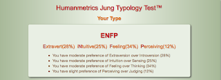
ENFP
How My Results Show How I Work With Others

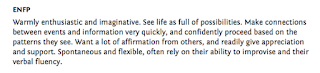
My personality test shows me that when i work with others,
I tend to like being in a group of a whole bunch of people
and backgrounds. It say that I tend to want authentic
experiences, and I often seek out what a person is feeling,
and thinking. I get bored easily with details and repetition.
I tend to want everyone around me happy, and I rely on my
experiences, but I want to go wherever inspiration leads me.
I tend to want to seek out situations where I don't have to do
what I'm not interested in, or just plain dull situations. If I
get in a group that is not fun for me then i try to make it fun,
but i end up getting really bored.
Misunderstood
In my pat there have always been people that have
misunderstood me, but it could just be because they didn't
understand my personality type. I try to make friends with
everyone I meet, and sometimes they don't want to be my
friend, because of this and their different personality they
have they just don't like me. My little sister and I are very
different, and we try to get along, but it's hard sometimes.
Maybe this is because we have different personalities.
What I Think Of My Results
 
I think that my results match my personality almost if not
completely right on. I love to help people where ever i go,
and i am always thinking in the moment Everything about
the results are literally spot on. Knowing my results helps
me a little to better understand why I am the way I am. I
always have had an impulse to help people when i get the
chance, and i am always doing things right i the moment.
Other ways that they describe help me better understand
too. I get really bored by repetition and the details when
someone is talking to me or giving me instructions, and
almost all my friends are completely different. I tend to
have a lot of activities or hobbies that I love doing. This is
all just a few of the many reasons why ENFP really fits me,
and is literally spot on.
 
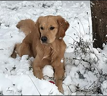
Lion/Otter/Beaver/Golden Retriever

The Lion/Otter/Beaver/Golden Retriever teat was a test to
see which animal personality you mostly match you. I think
what I got was pretty accurate. I got a Golden Retriever as
what I am most like, and an Otter as what I am second most
like. The golden retriever, tells me that i am loyal to my
friends, and try to be kind to everyone. It also says that I have
a hard time expressing myself, but i am always good at
helping others, and staying calm. It also says that I have
friends but a few close friends, but I have a hard time with
the issue of trust. The Otter tells me that I talk a lot, and am
always trying to please others. It also tells me that I am known
for having a messy room, which is funny to me. That is what
this test has told me.

What I Learned
These are all things that I know now thanks to the
personality test. I know why some people don't get along
with me, we have different personalities. I now know why
I am the way I am, and why I act a certain way different
from everyone else. Now I know how I act in curtain
groups, or in teams. I also know that I am not the only
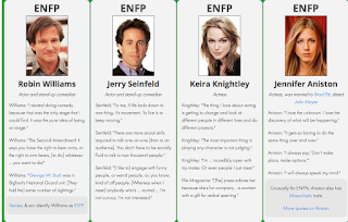
one with this personality, and what famous people have
my personality too. I found out that I am most like Golden
Retriever, am loyal to all my friends, have a kind heart, but
have a hard time expressing my emotions. And I know that
I am made this way and I should love they way I am, no
matter what others say about my personality.


Running from point A to B

How I Filmed My Video

We all got into groups of 4 with one director. The teacher
chose the director. Then the students pic the director. My
group consist of a whole bunch of different people, which
gave us a lot of good ideas. No one else was willing to be
 the actress, so I stepped up to the plate. We filmed all
over the school, but it took us a long time to film. We did
a lot of interesting things with the camera, for example we
filmed the feet running, and we filmed a big thing in the
cafeteria. It was a lot of fun.

How I Edited My Video 

Editing my video did not take as long as filming. I had to
find music that went with the scene, and matched my feet
movement. I even put in a sound effect. I had to cut out a
lot, and speed up the video a little sometimes to make it all
fit in the span of 1 minute. It took a long time but I liked
doing it and had fun.

What I Thing About This Project

I love how my project turned out. even though it took my
group a long time to film, and it took a long time to edit, to
me it was worth it. The people in my group are now friends
to me that wouldn't have made if we didn't do this project. I
also just had so much fun filming and editing, its just
something that I love doing. These are some of the reasons
why i enjoyed doing this project.

Sunday, February 4, 2018


 How To Print / My First Video

The Process Of Filming It

The first thing my partner for the project and I did was figure
out how to use a Tripod. Once we figured that out we started to
record our video. We wanted to start showing the library sign
above the door, but we every time we tried the camera would
shake. There are too many bloopers for this, but the bloopers are
honestly my favorite part of filming. We laughed so much, it was
so much fun.

The Process Of Editing It

Editing the video we probably just as fun as filming. First I
looked threw all my film to find my best shots. once I found
them I took the audio from the film and deleted it. I found a
loyalty free song and put it over my video. I put some transitions
like fading for the video and audio to make it even better. Then
I posted it on Youtube.

What I Think About It

I love how my video turned out. The process of filming it was so
much fun, I couldn't stop laughing going through all the film to try
and find the right film was even funnier. The finessed product to me
is very impressive, and I hope everyone else likes it.

Friday, December 15, 2017

My Website

My Website

 About The Website 

The website I made took a long time to make. It turned out great, but I still had a couple slip ups. At one point dreamweaver started to glitch out on me, so I had to redo what I was doing.  It has some pastel colors to complement the colors of the projects I have in the website. I learned a lot from this project, stuff I wouldn't have known if we didn't do this. I just can't believe I made a website, and I hope you think its as cool as I think.

The Process Of Making It

 We did this project on dreamweaver. First I made the front page, put our picture on it, and made all the links work. Then I made the projects page, and put 4 projects on it. I made the link work that goes from the home page to the projects page. I made a youtube channel and copied a link for my bouncing ball project in it. After
that I colored it, and changed the fount. When I was finally done
I looked back and previewed my website. I think it turned out great.

What I Think Of It

My website looks great, works, and is a really big accomplishment of mine. Yes it did take a long time, and yes I did mess up a few times, but I am very proud of it. It takes a lot of effort, knowledge, and patients to make a website, and somehow I was able to do it. I hope that you guys like it as much as I do.

Wednesday, December 13, 2017

My House Design

About The House

The house was based off of another house that I found on 
http://www.houseplans.com. It is a really small house, but 
it is a cute small house. there is a front porch, and a pitch at
 the side that could be used as like the back door. The house 
is a log house, and has really detailed features or it, for example, 
the windows come out at a point and have cool designs on it. 
The house also has a chimney. 


The Process of making it

This project took little bit longer than I would have expected. 
I would either keep messing up, or it wouldn't save, witch was 
a little bit frustrating. We used Sketchup, and honestly I didn't
 really like using Sketchup. First we found an image online, 
then we based the structure off of it. The house I choose was a 
little bit basic, so I made mine little bit more complex. after we 
made the structure we made details, and then colored it all in. it 
was sorta like a big coloring book. We went online and found 
some images that we could use for our house and turned them 
into wallpapers, and put them on the house. Then we made slides
 for our animation, and saved for web. We finally finished, and I 
am happy with how it turned out.


What These Are

The images below are photos that I found online and
turned into wall papers that I could use. I used all three
of them, and it was fun to have made the wall paper a
wall paper myself.


What I Think Of My House

The final product was little different than the picture I was going off of, but I still think it was a really cool house. I love how it turned out. The house itself took a while to make, and I even had to start over a couple times because either I completely messed up, or it didn't save. I didn't really like using Sketchup, but I still had a lot of fun. I hope you guys like it just as much as I do.

Thursday, December 7, 2017

Bouncing Ball gif

My Bouncing Ball Animation!

About The Projects

All three of the animations I made are all done in Photoshop.
Each layer of the animation was all done on the computer. The
background and balls are hand drawn with my mouse.  In al it
took approximately 3 days or more per animation. There are
more than 15 slides for each animation.

The Process Of Making Them

Each animation took about 3 days to make. It took so long
 because each side had more than 15 slides, and it took a wile to
 figure out how to make them. First I made the grass  in the
 background with 2 or three different colors. Next I made a
second slide with the balls on it. I drew a line to show how I want
it to bounce and then made a hole bunch of slides for each
individual ball. For the alien project, it took along time to do all
 of the details. I almohad to hand draw and animate the alien eating
the ball. It was all worth it tough because each animation turned
out really cool. 


What I Think About The Project

I love the way my project turned out. It did take a while to do, and
to figure out how to do it, but it was still really fun. The way my last
 one turned out was my favorite one. I like how no one else made
theirs like mine, and that I can be proud of it all because I hand did
everything. The Idea of 3 suns was from movies inset watch as a kid.
 I made the alien black and green to stand out, and I made the ball
look like it does because I think it looks really cute. I am proud of all
 the projects I did, and am happy I turned how to do them.

Friday, November 10, 2017

10 Words Gif

10 Words Gif


About The Gif

This project is 10 words that describe me. This project is also my first animation! For the animation I was told to put my name and the 10 words used to describe me, they were picked out beforehand, and to make them appear on my project. Right in the middle is my name. I chose the colors you see to make sustain words stand out. Some of the words chosen for me was things like rhythm because I love music and I am always keeping a rhythm with me, or story teller because I love to tell/make stories and I'm always making one and in my own story. I loved making this animation and I hope you like it too.

Process

For this project I went on photo shop and started off by writing my name. Then I typed out the 10 words that were used to describe me. I love founts so I chose a different fount for almost all of the words on my project. After I chose my founts I put different colors to make curtain words, and my name stand out. After that the real fun began. Now was the part for the animation. I took each word one by one and put them out of the shot only to come back in. This was a long proses but it was worth it. After I finished the animation I saved it and now its on my blog for everyone to see. 

My Personal View Of My Final Project

I personally loved making this project. Some things were hard to do, for example; animating every single word one by one, or making sure its all spaced out right and looks good. Even though some things were hard I still had fun making it, and I have pride every time I watch it. The finished project looks good to me, and I hope you like it as much as I do.

Tuesday, October 17, 2017

My Logo


My Logo

The Process


When I started this project I was thinking about what cool thing I could do with the letter S for Sydney and/or D for Decker. I drew a lot of different designs, as shown below.


I picked my top 4 designs and immediately knew which one I liked, I chose the first one. I liked the fact that no-one else would have this design. When I started the design I chose it started with a cursive S, and changed it until it looked like what it is.


I started to create my design on Adobe Illustrator, and messed around with it. I found some good founts that I liked and could use for my logo. I accidentally moved the inner triangle down little and liked it, so I just left it.

I started to play around with the color, and desired I liked the mistake design I made, so I colored it too. The colors I liked most was the orange, mint, purple, and blue. I asked my fellow  classmates which color they liked best and the majority was orange, witch was good because I liked the orange the best. I really wanted to put it on a black shirt so I tested what it would look like on the black. My final product can be seen either above or below


Then I put my logo on a t-shirt, that I customized, and I love how it turned out.

Why My Logo Is How It Looks


This is my final product! I personally love how it turned out, and I hope that everyone else agrees. I made the main color orange because it would stand out, and because orange is the color of happiness and warmth, and I want people to be happy and feel warm inside when they look at my logo. It has a red outline to make the inner color stand out more. I chose this fount because it looked professional and classy.


Everything is the same as said before, except for the mint green letters, witch are mint green because it stands out, I like it, and it makes it look really cool.

Semester 1 Summary Some Projects I Have Done In Semester ; This project is a graphic I put together in class  that involv...